
Dies ist die englische Übersetzung, lies den ursprünglichen Artikel hier!
Leaving behind a challenging and exhausting 2025, humanity yearns for a more peaceful 2026. One corporation aims to provide an offer meant to deliver the basis for the most adequate mindset.
In the pseudo-secularized 21st century, one esoteric-religious tradition perseveres – the horoscope. Every week, readers of countless magazines direct their hungry gaze towards the crucial pages and proceed to spend the following week according to the stars’ constellations. Tauruses should postpone life-changing decisions, cancers should avoid driving their car, the list goes on, the practice is widely known.
Humanity, highly modernized and anxiety-riddled, has elevated this seemingly archaic tradition to new heights. Today, the alignment of one’s own life veers beyond interpretations of just the nightly firmament. There also has been a steady development of bestowing and interpreting meaning to other aspects of the tangible, material world as well. There’s the bird of the year, the tree of the year, the animal of the year, … The list is virtually endless.
While one can still find a semblance of practical meaning attached here, one category of pseudo-horoscope decidedly ventures into absurdity: the Pantone Color of the Year.
What your 2026 will be like
A short delineation for everyone lacking expert knowledge in the color-universe: Pantone is a company most known for their color swatches based on their Pantone Matching System (PMS). First developed in 1963, today its core customer base and application is located mainly in the spheres of graphic design and print; offering 12,807 different color swatches. For €238 – peanuts! – interested customers can purchase the entire range in the form of a handy color fan, allowing for clearer, specific “tonal communication”.
If the entirety of the realm feels too dizzying, fret not! Basic users won’t need the whole assortment in order to lead a colorful life. Much more important, as mentioned before: the Color of the Year. For 2026, Pantone LLC revealed a shockingly punchy hue – this year it’s all about PANTONE 11–4201. After swiftly consulting the color fan, 11–4201 is introduced as the mystery-shrouded Cloud Dancer. For those who’ve currently misplaced their fan: Cloud Dancer is white. Of course not a boring, simple, standard white, but instead “a billowy white imbued with serenity”. No further questions, your honor. Furthermore: “[It’s] a launchpad for creative expression, as individuals and communities eager to reset are experimenting beyond traditional boundaries, opening the door to innovation.” The perfect color for the Burg’s next annual art exhibition.
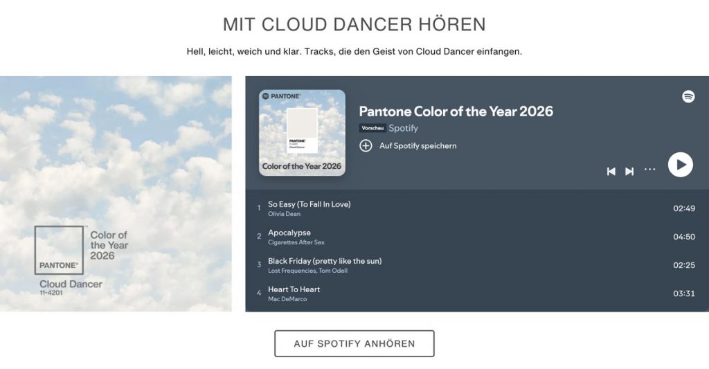
Screenshot: website pantone.com
Why exactly this color? The heads of the “market leader in terms of color communication” are eager to answer. For Leatrice Eiseman, Executive Director of Pantone Color Institute, Cloud Dancer is “a promise of clarity”. In a flurried and ever changing world, Cloud Dancer offers “a conscious statement of simplification [and] enhances our focus, providing release from the distraction of external influences.” A self help hue, how convenient.
For Laurie Pressman, Vice President of Pantone Color Institute, „Cloud Dancer signifies [the] desire for a fresh start, […] opening the door to new approaches”. The color is more than just a color — it also accrues epistemological value: “Cloud Dancer encourages true relaxation and focus, allowing the mind to wander and creativity to breathe, making room for innovation.”
Material Girl in a Cloud Dancer World
Let us recap for a second: White – sorry, Cloud Dancer of course – is now not only the color of whiteboards, office building walls, IKEA Kallax shelves, clean girls, … No, it is the color of new perspectives, hope, and mindfulness in these turbulent, trying times.
But Pantone is not just offering spiritual support with their Color of the Year. There is of course an entire range of merchandise aimed to upgrade the material life of those in pain(t)ed need. A small selection:
- The official Cloud Dancer mug, for example – for only €33.32 it practically guarantees a mindful start to your day
- The Cloud Dancer key chain – dirt cheap at a price point of €12.42, esteemed customers receive a … key chain. No, apologies: “A simple, subtle reminder of clarity and focus wherever you go.”
- Official Cloud Dancer Play-Doh – advertised without a price quote, this play tool allows the creation of promising alternative societies and utopias, staunchly detached from the current hyper-capitalistic system that is plagued by overconsumption.
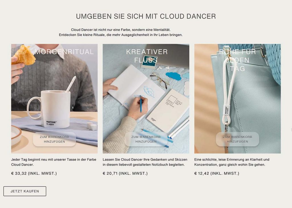
Screenshot: website pantone.com
Color-Crazed Commentary
In the end, you reap what you sow: Naturally, Cloud Dancer attracted the attention of feuilletons far and wide, authors frothing at the mouth to give their sacred opinions, ranging from well-meaning style critiques to scathing reviews invoking themes of culture wars. According to the Süddeutsche Zeitung, Cloud Dancer poses as the antithesis to the “neon hell of the globally digitized reality”, the Zeit commends the poetry-invoking descriptions of the color, and at the NDR a professor for color design, Timo Rieke, states: That hue is gracing all our walls already anyway.
Ulf Poschardt’s neoconservative culture war engine – available at any given train stations’ kiosk, named Welt – ascribes the color an escapist tendency. While it lacks a reminder of the truthful realizations of the political reality, Cloud Dancer evokes associations with the “nicotine-drenched hair of may-God-rest-his-soul-Helmut-Schmidt” or “the wall of a delinquent from Friedrichshain smoking ten joints a day”. That escapism I can smell.
Less obtuse polemics are offered by journalistic outlets left of the ominous political center. Taking in the calm Cloud Dancer, the Jungle World offers the question: Which colors would be considered vulgar or chaotic? Monopol magazine, popular in the artistic scene, calls the choosing of 11–4201 a “statement of capitulation”, which establishes a connection to skin color and its significance within the public discourse. And the Freitag declares the color a warning sign for the era of “emerging global fascism”.
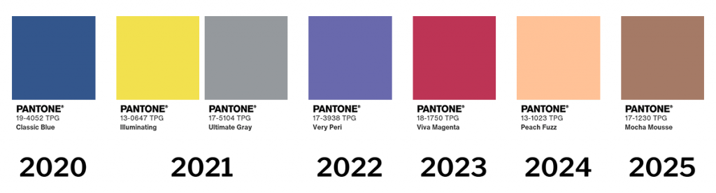
To that, one has to say: Cloud Dancer is not the first Pantone Color of the Year. On their website, each year from 2000 onward is connected to at least one color, promising clairvoyance and guidance. Staring at the timeline, a bleak picture starts to construct itself. The backsliding begins in 2021. Two colors were honored: 13–0647 Illuminating for one – colloquially known as yellow – and 17–5104 Ultimate Gray – gray! 2022/23 were just slightly more colorful, then from 2024 onward the color palette got more and more fascist. While with Peach Fuzz, only a slightly brown hue was picked in 2024, the choice of Mocha Mousse in 2025 was the definitive blinker, indicating a merger onto the far-right lane of the highway. This year it’s white, then surely next year will be: 19–4003 Black Onyx. Apolitical black.
In for a Cloud Dancer, in for a Culture War?
Maybe let’s pump the brakes a bit, it’s getting hard to see the paint box for the interpretative offerings. The culture war, of both right and left political hue, enters a new playing field. To me, this is maddening. Of course nothing, no decision, is ever made in an apolitical context – but not every indignation must spiral into a widespread public outcry. In the end, the whole hubbub is most likely a very clever marketing strategy for Pantone LLC. It creates tons of digital traffic at the beginning of the year and allows them to showcase their products to a bigger audience.
Here are my two cents, after a frankly absurd amount of time pondering the topic: Cloud Dancer is a pretty fucking lousy choice for Color of the Year. White is not invoking anything within me, like at all. Not even rage. It’s not politicizing me in a new way and I honestly find other topics more important than meta-political color games. In the end, yet another feuilletonistic essay explaining why Pantone is paving the way for global fascism won’t prevent no AfD state premier in Saxony-Anhalt.
Translation: Ellen Helmecke